A 1970s house transformed into a warm and contemporary living space where redwood surfaces meet splashes of color and artworks.
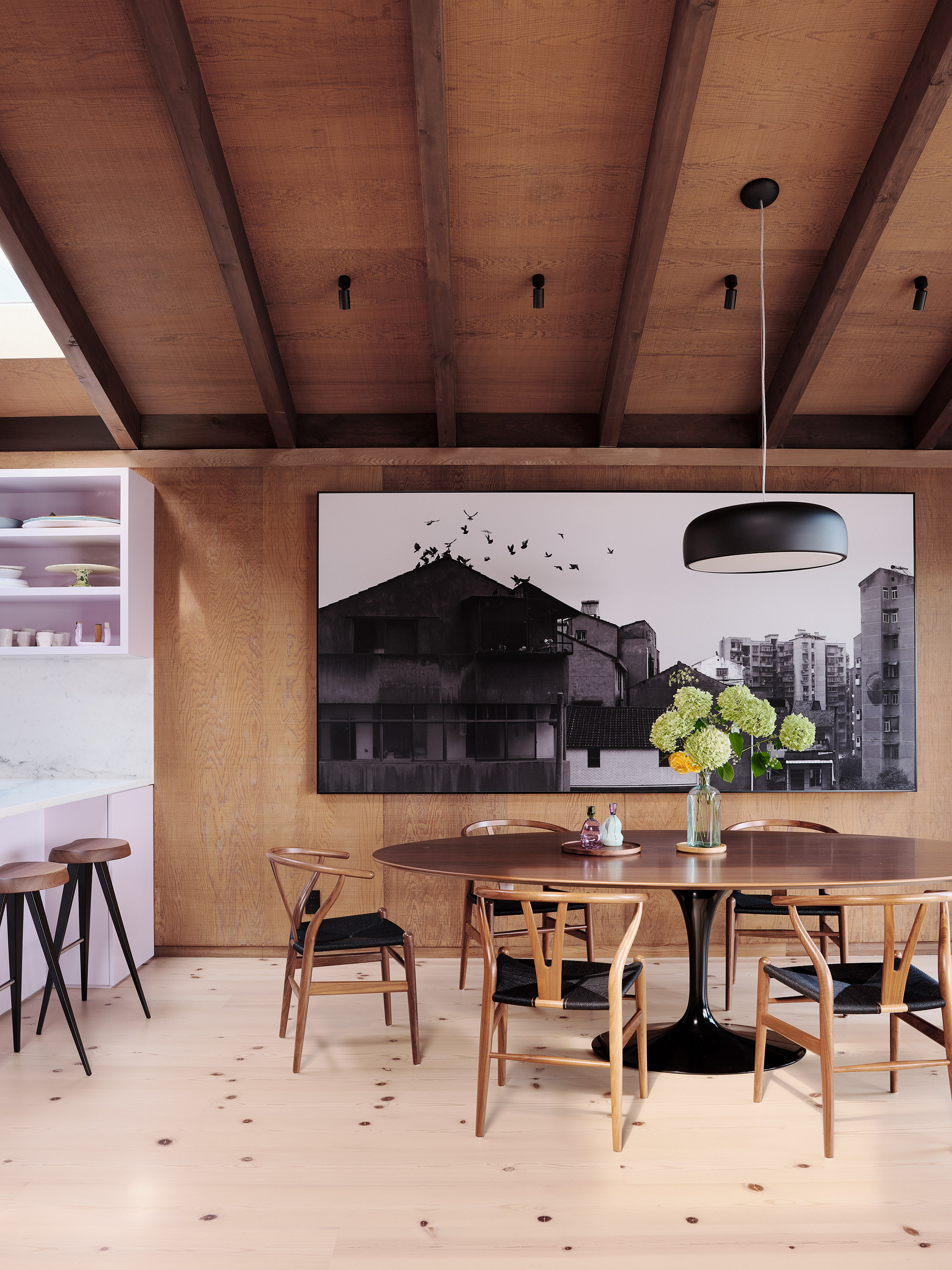
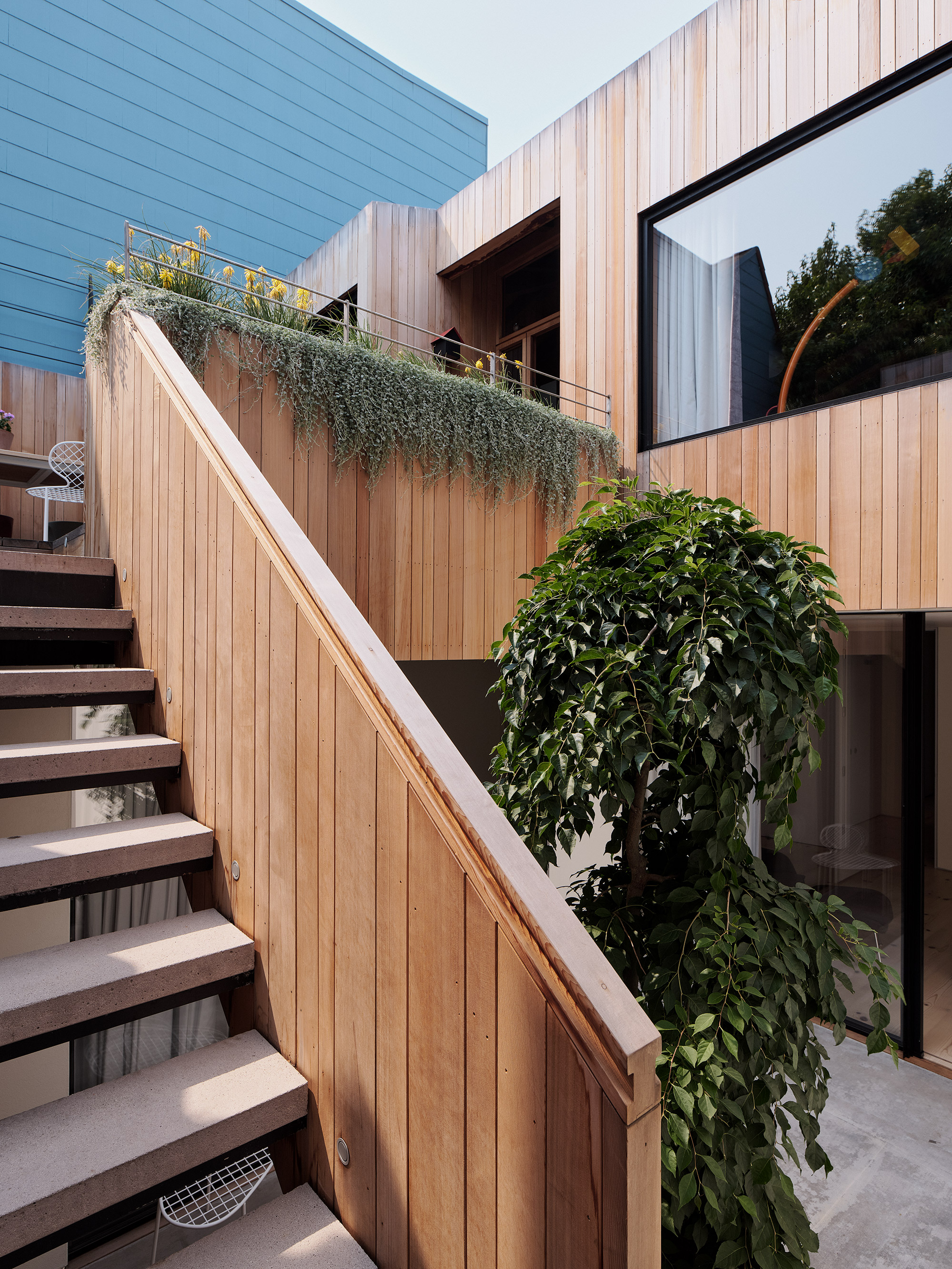
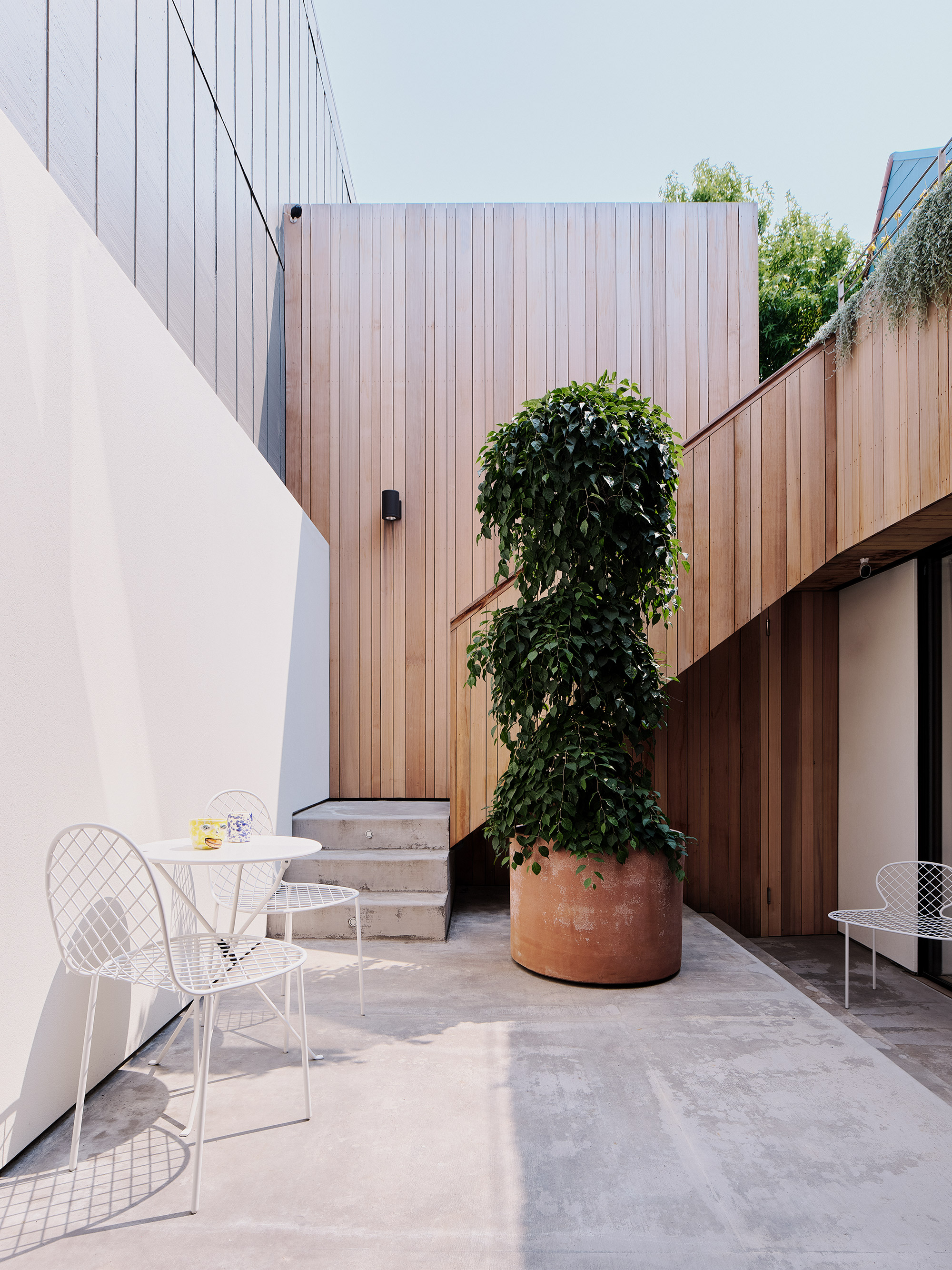
Located in the picturesque Noe Valley in San Francisco, this house dates back to 1974, when architect Albert Lanier designed it with angular forms, redwood-clad interiors and courtyards. The current owners tasked local architecture, design and interior design practice Studio Terpeluk with the complex mission of modernizing the living spaces and expanding the floor plan. All this without altering the character of the original house. The studio added a new guest suite, home office, media room, and wet bar, effectively enlarging the available space from 210 square meters to 299 square meters. Both the façades and the courtyards now feature redwood cladding, a natural material that gives warmth and a vintage quality to the architectural design.
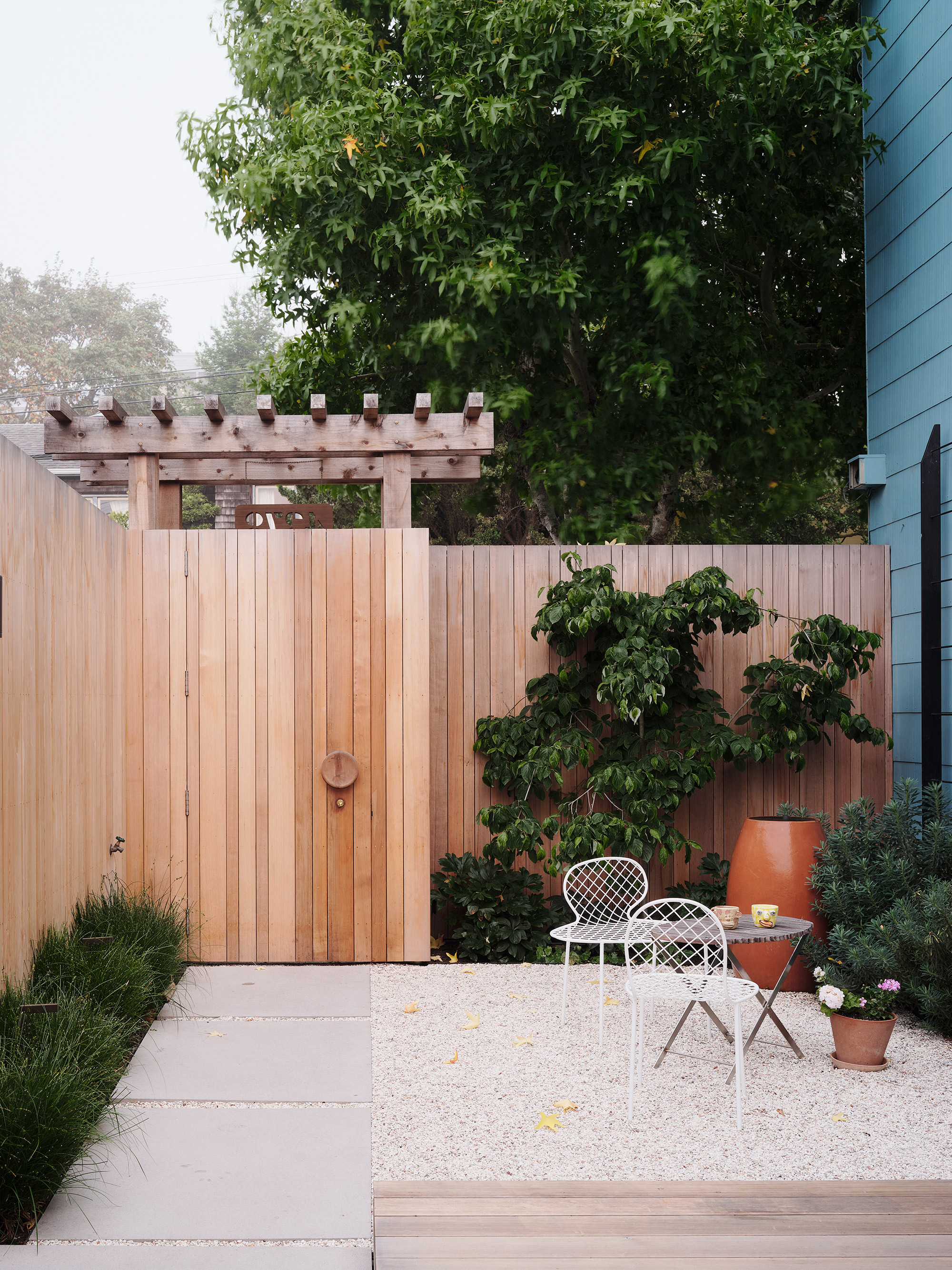
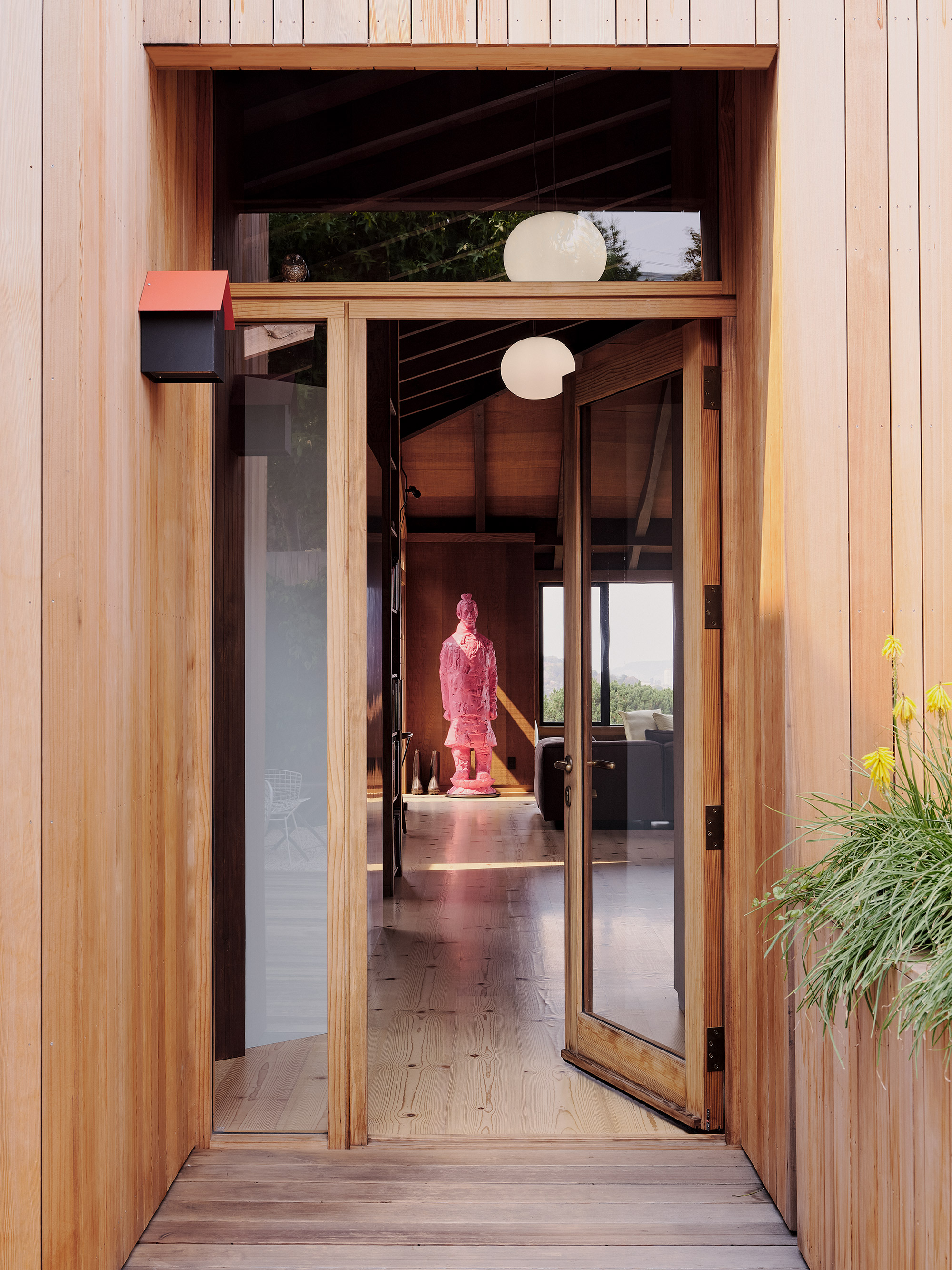
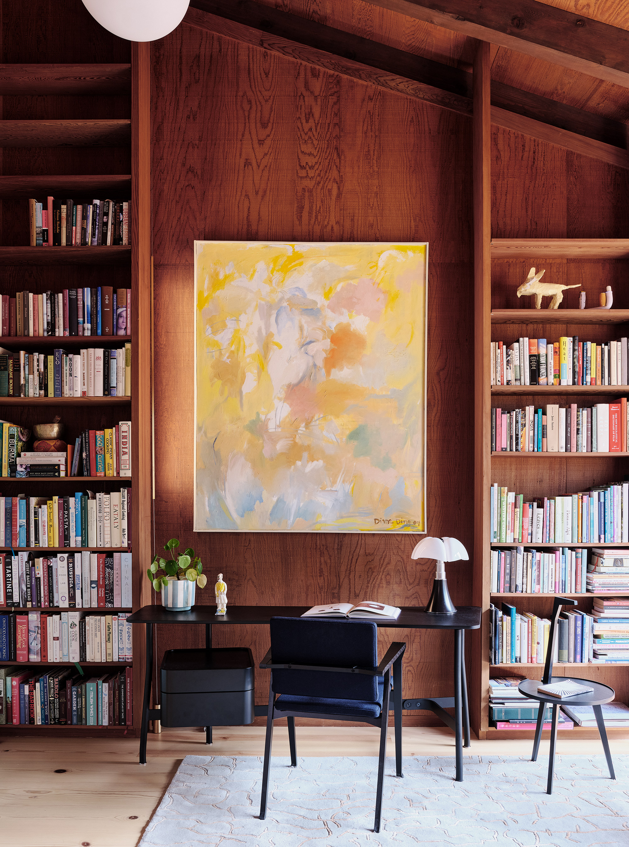
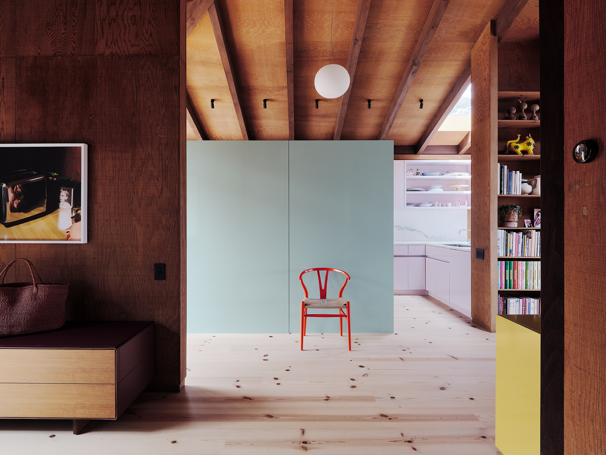
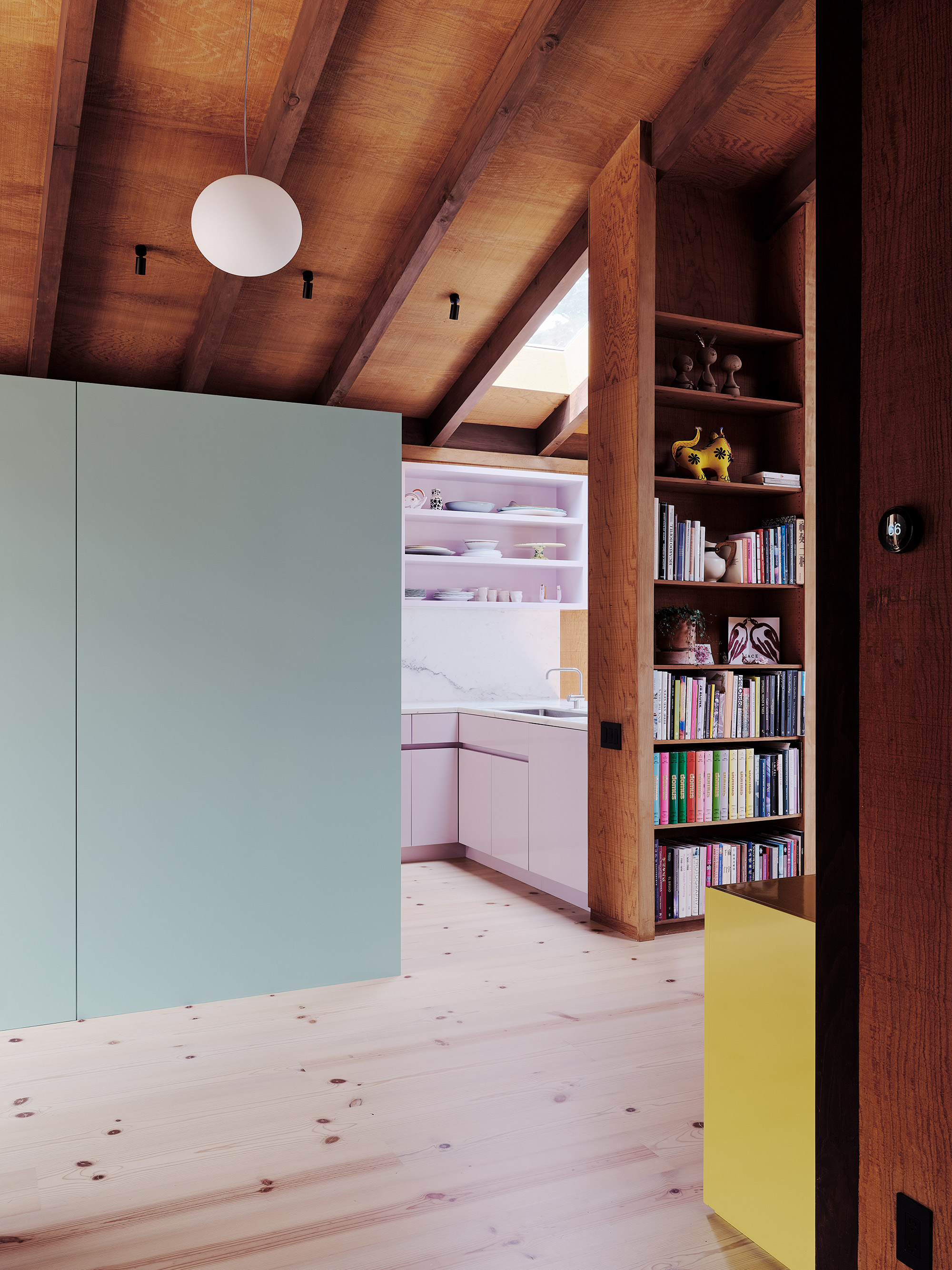
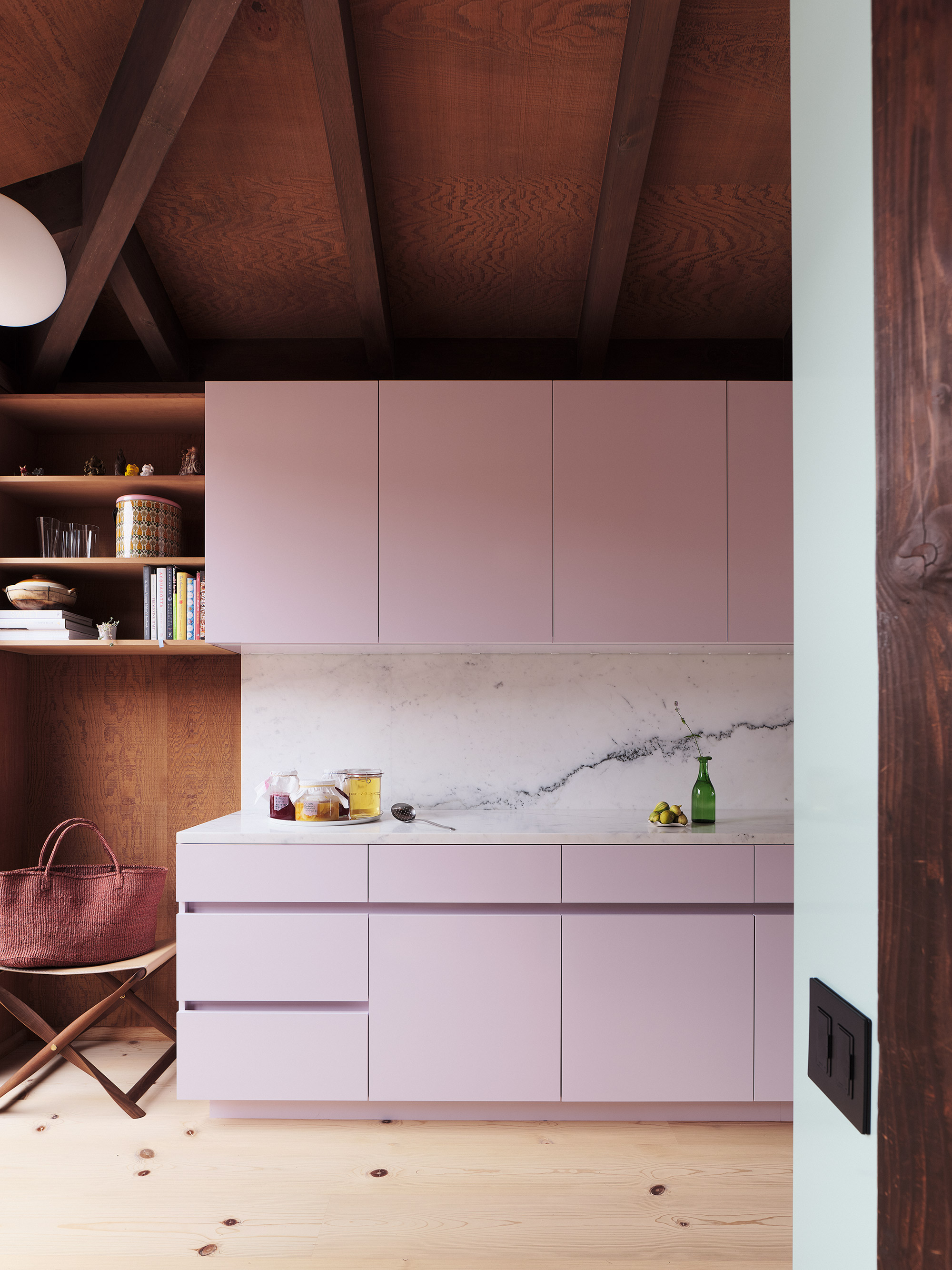
Inside, the team opened up the living spaces to create a better flow between different areas. The architects also created a dialogue between indoor and outdoor areas and used redwood throughout the home. Right from the entrance, guests step onto a cozy courtyard with redwood decks and precast concrete surfaces. Located close to the front door and to the left, a gloss cabinet conceals the kitchen that then opens to the dining area. To the right of the cooking and dining space, the studio placed a library with a desk and bookshelves. This zone also overlooks the private courtyard.
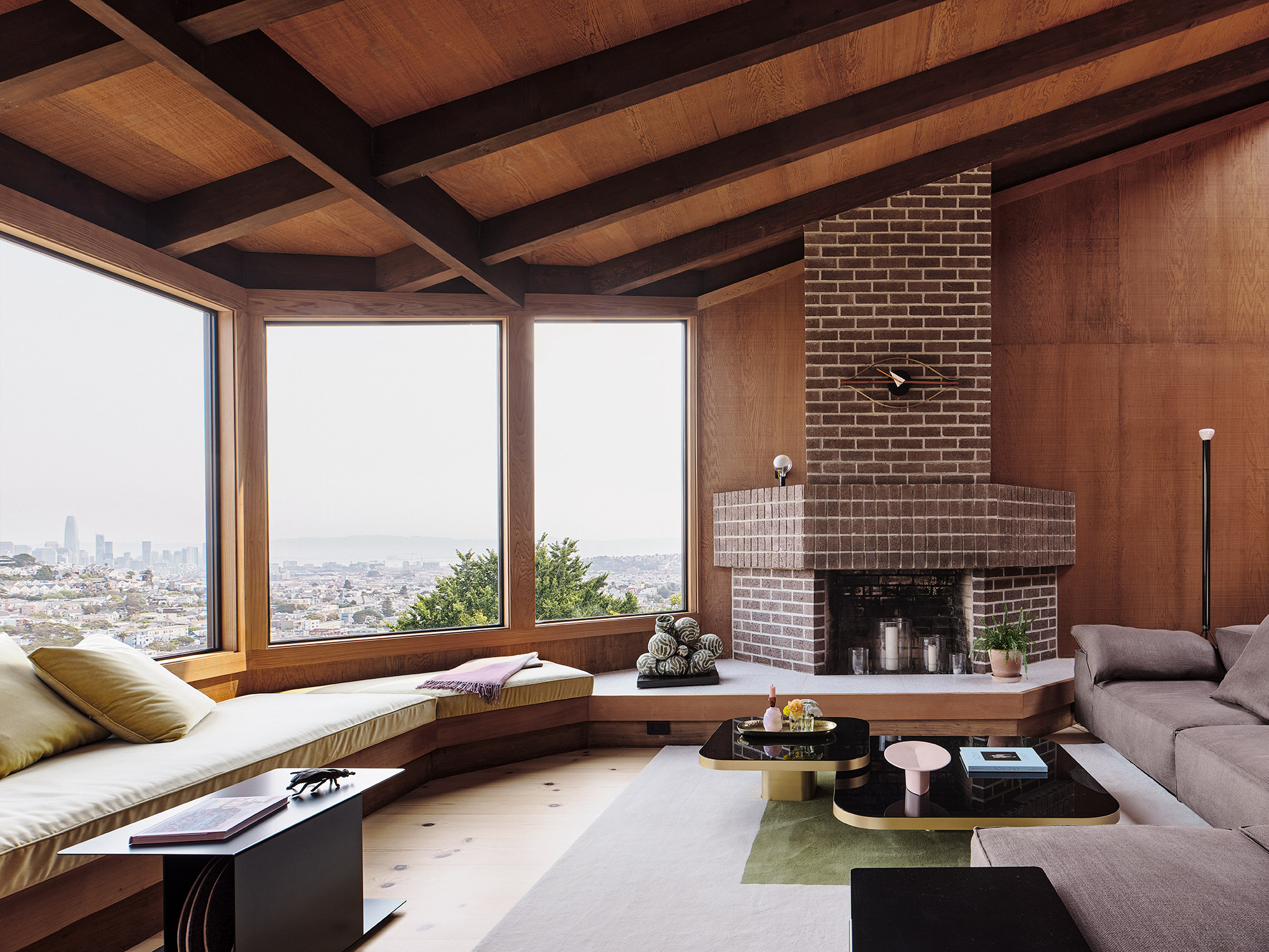
On the upper level, the open-plan living room boasts reclaimed wood flooring with dark knots, crafted from repurposed pier pilings. This area boasts sunken lounge spaces and expansive glazing that provide stunning views of the city’s skyline. Padded seating extends to reach a brick fireplace. A large-scale pink sculpture created by Chinese artist Wanxin Zhang rivals the panorama and also showcases the creative couple’s love of art. A glazed lightwell illuminates the sculptural staircase made of blackened steel and walls of rough-sawn redwood plywood.
Eclectic spaces where light, color, and materiality take center stage.
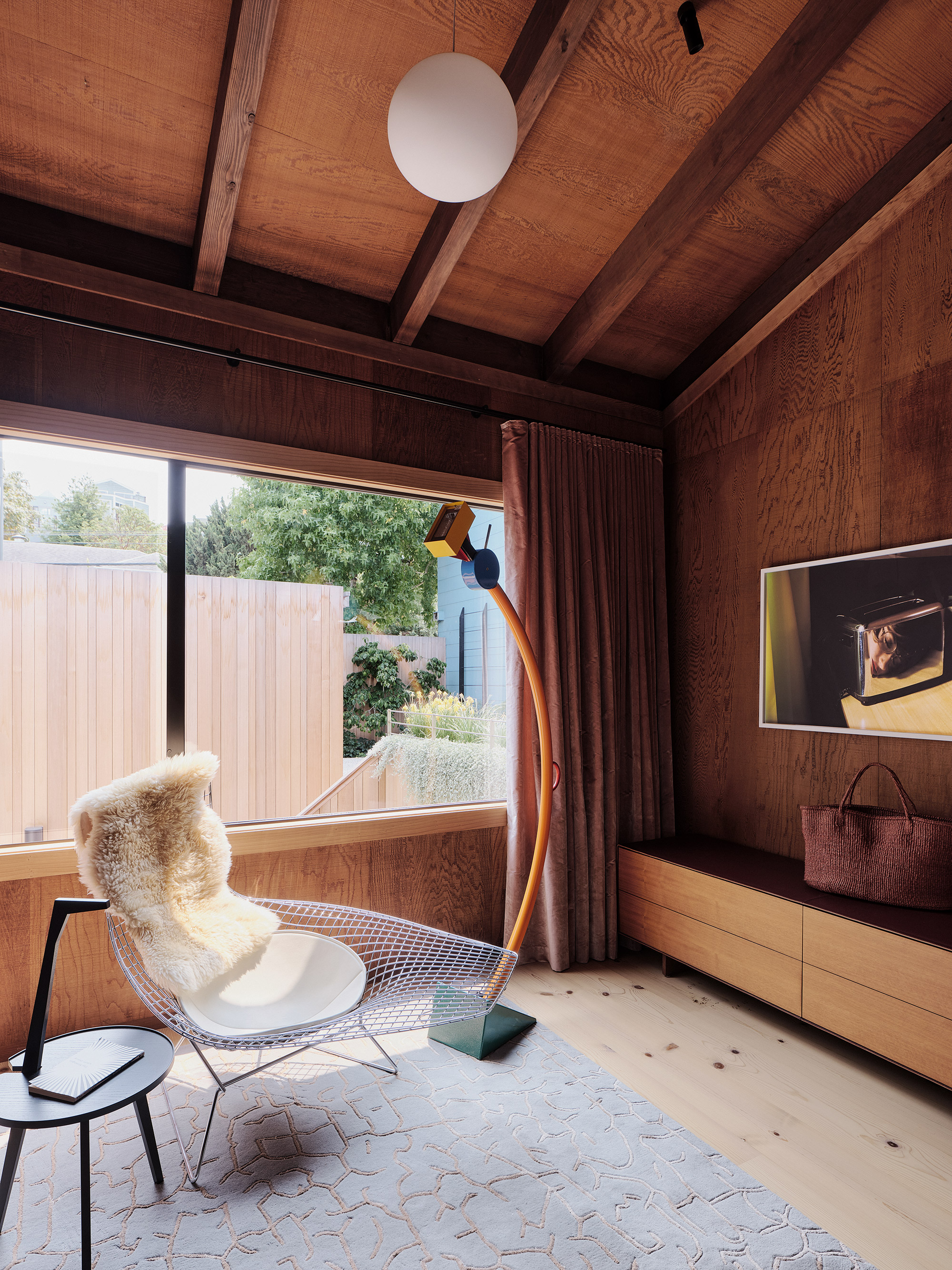
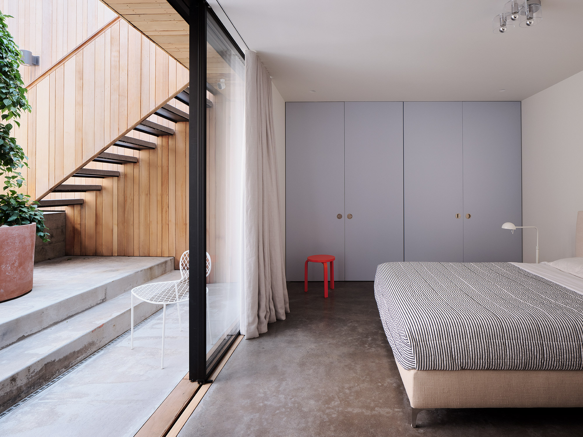
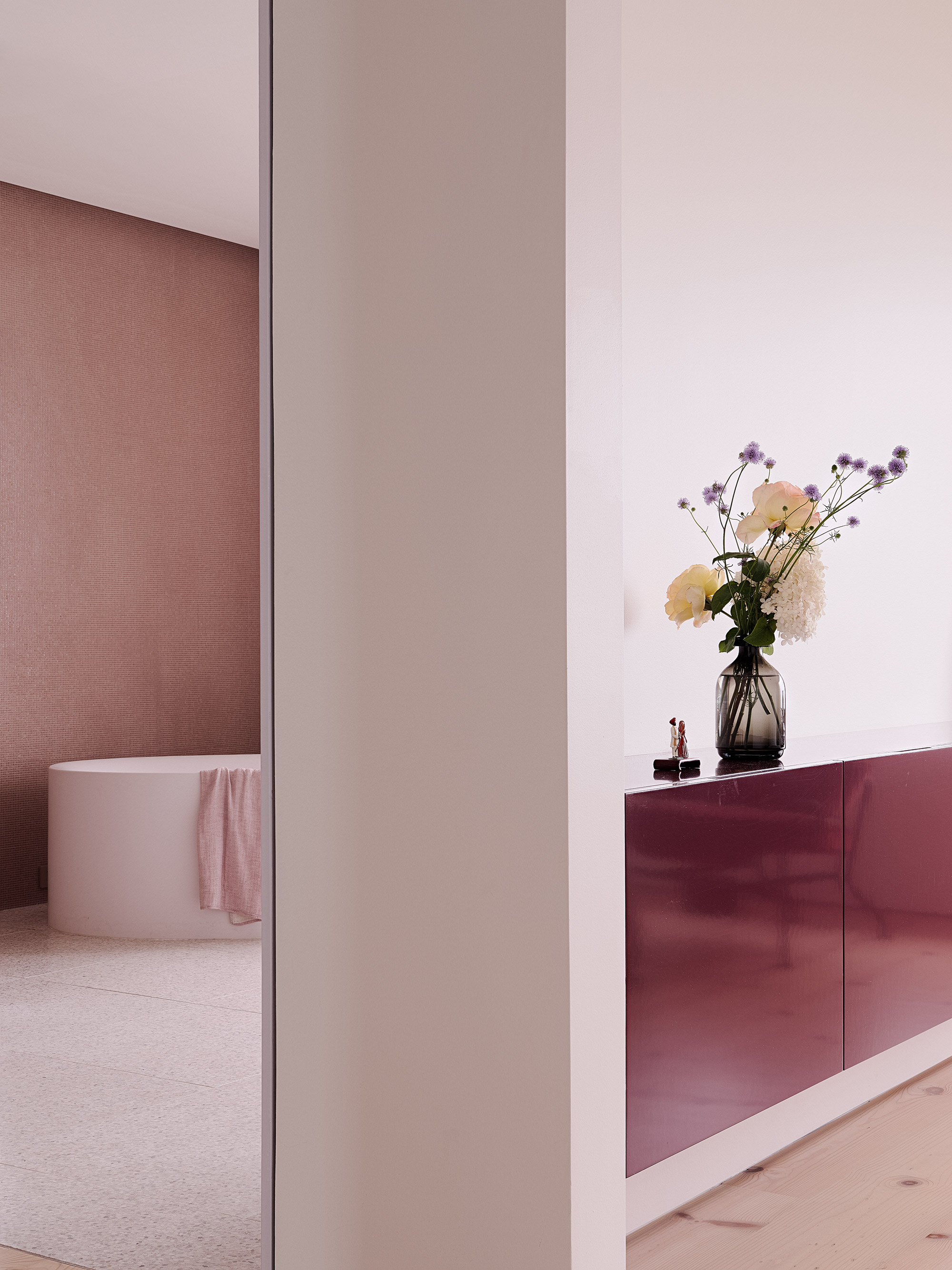
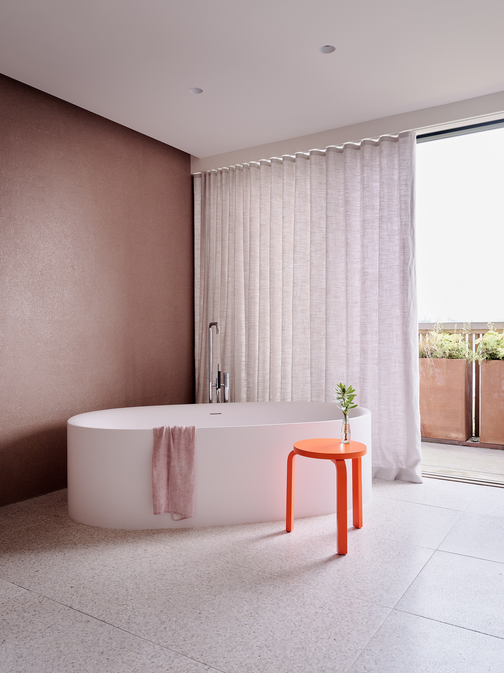
Beneath the social areas, the middle level houses a guest suite with a private lounge area. This suite also has access to the patio and to the entry courtyard. On the other side, there’s the main bedroom along with a bathroom finished in pastel colors. Apart from pink terrazzo tiles, this bathroom also features light Indian red recycled plastic tiles in a micro mosaic pattern. “Color was a recurring theme in the exquisite and eclectic art collection of the owners. This went perfectly hand in hand with my interest in mid-century Italian design and its bold use of color. We collaborated with our friend and designer Beatrice Santiccioli to enrich the project with a dedicated and bespoke color language,” says Brett Terpeluk, founder of Studio Terpeluk.
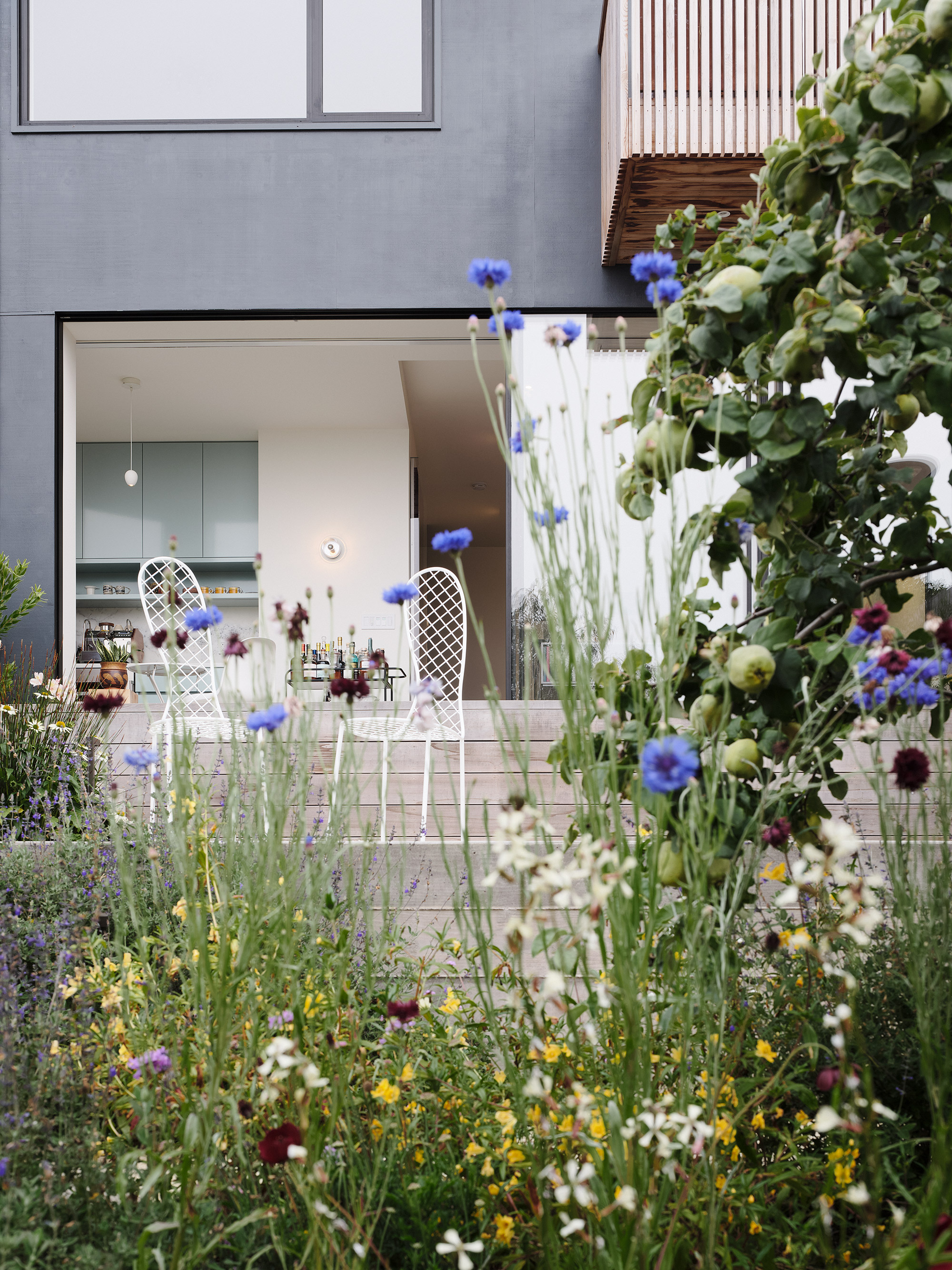
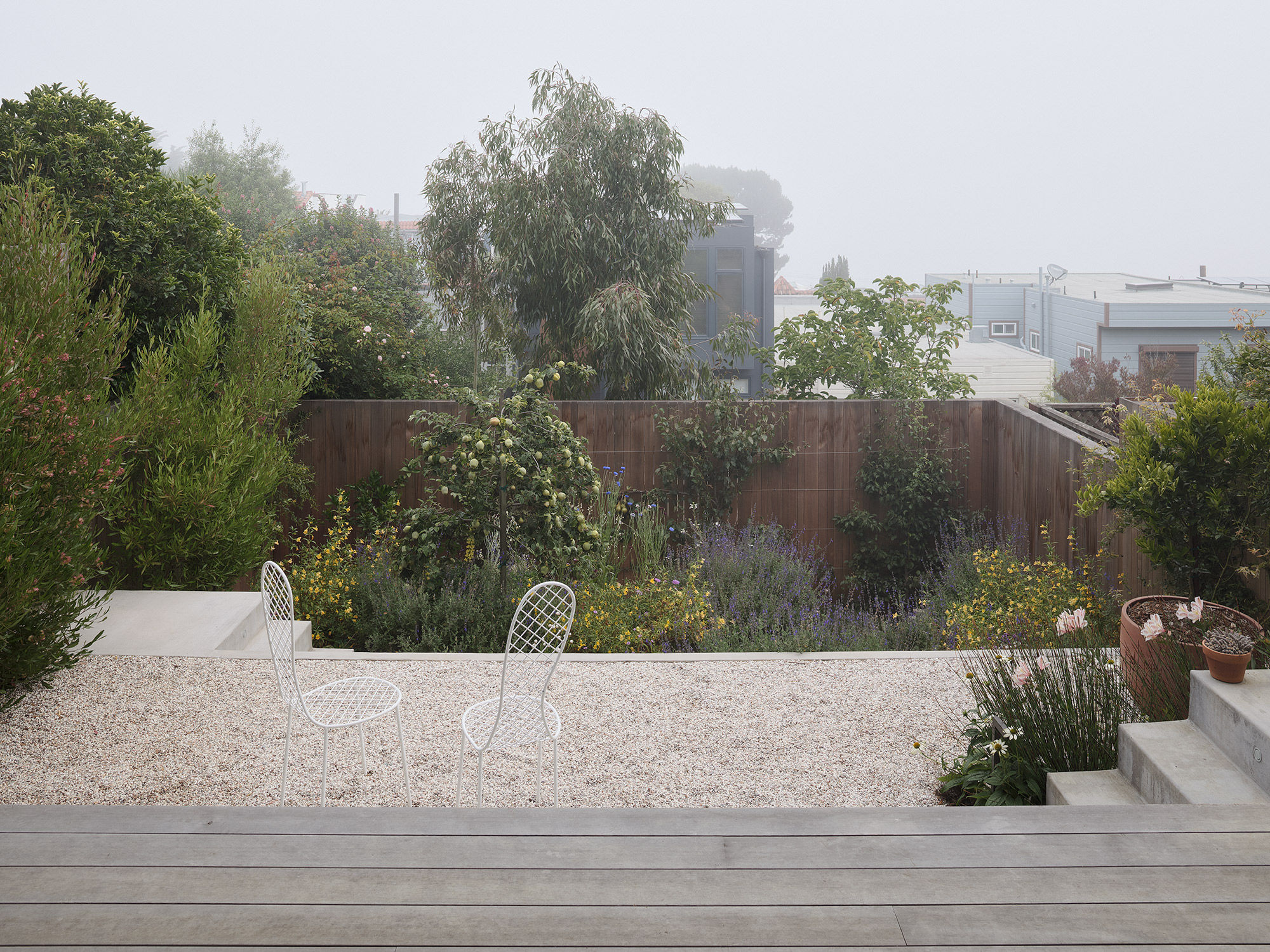
The lower level houses a new media room and a home office with a kitchenette. Here, the studio extended the concrete flooring and the living spaces to the outdoor areas. Finally, the house comes to life through its landscaping, completed by Italian landscape architect Monica Viarengo, Brett Terpeluk’s wife and long time consultant. Located on different levels, the courtyards and gardens are in turn wild, lush and curated. At the back of the garden, two terraces feature California natives with plants in bloom that attract pollinators. Also there, Rosa banksiae “Lutea” that climbs on a slatted cedar fence, beautifying it with yellow flowers. The lower terrace is home to pear espalier trees as well as fragrant thymes. Like the living spaces, these outdoor areas feature splashes of color. Here, blue, yellow and orange hues brighten the lush greenery. Photography © Joe Fletcher.


