Bittersweet and loaded with meaning, the Alptraum chocolate design project created by Nora Kaszanyi explores a difficult subject in a simple but also powerful way. The Budapest-based graphic designer took inspiration from her own traumatic childhood experiences to design the chocolate and its packaging. As a result, the project has an undeniably strong presence. It invites the viewer to take a closer look and find out what hides underneath the elegant package.
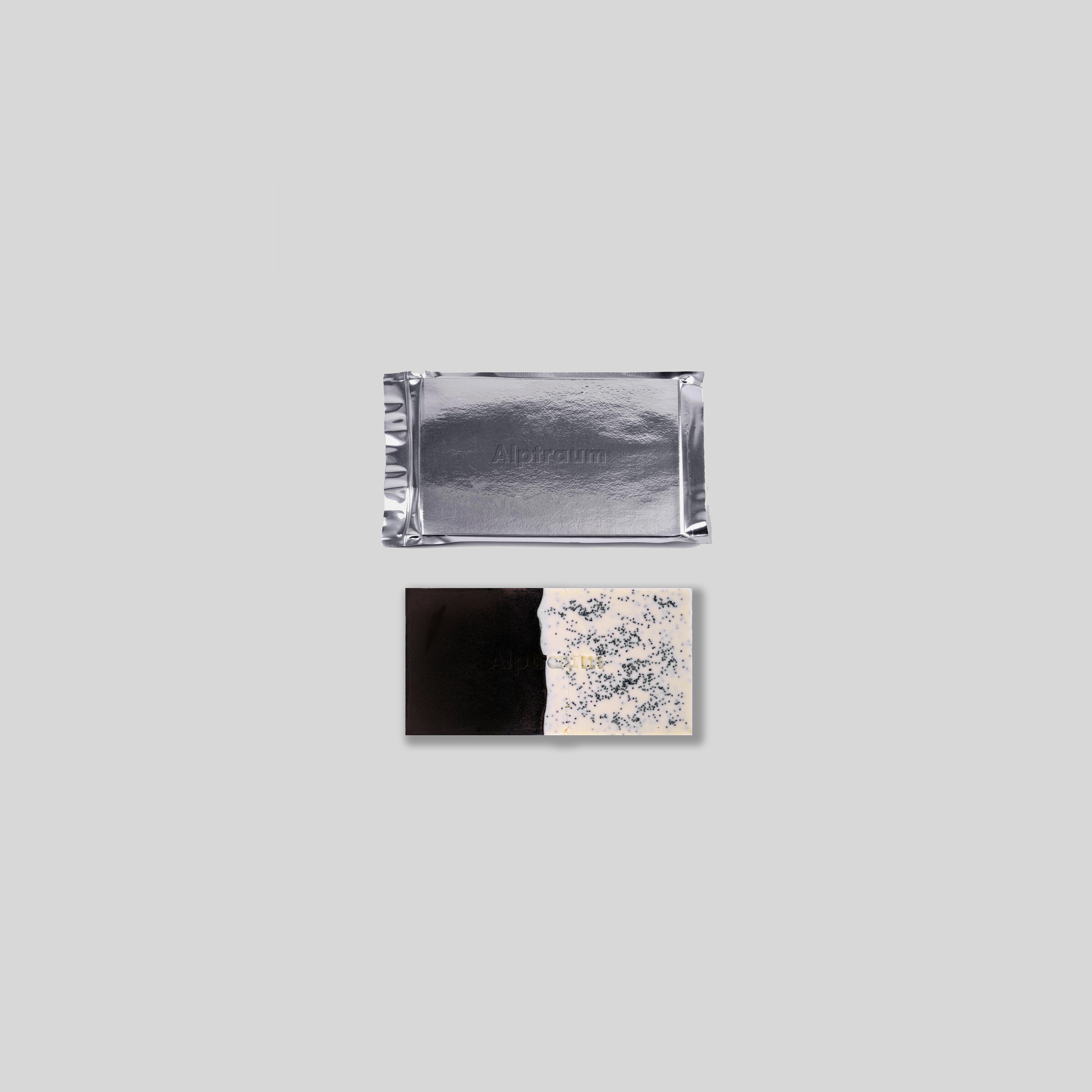
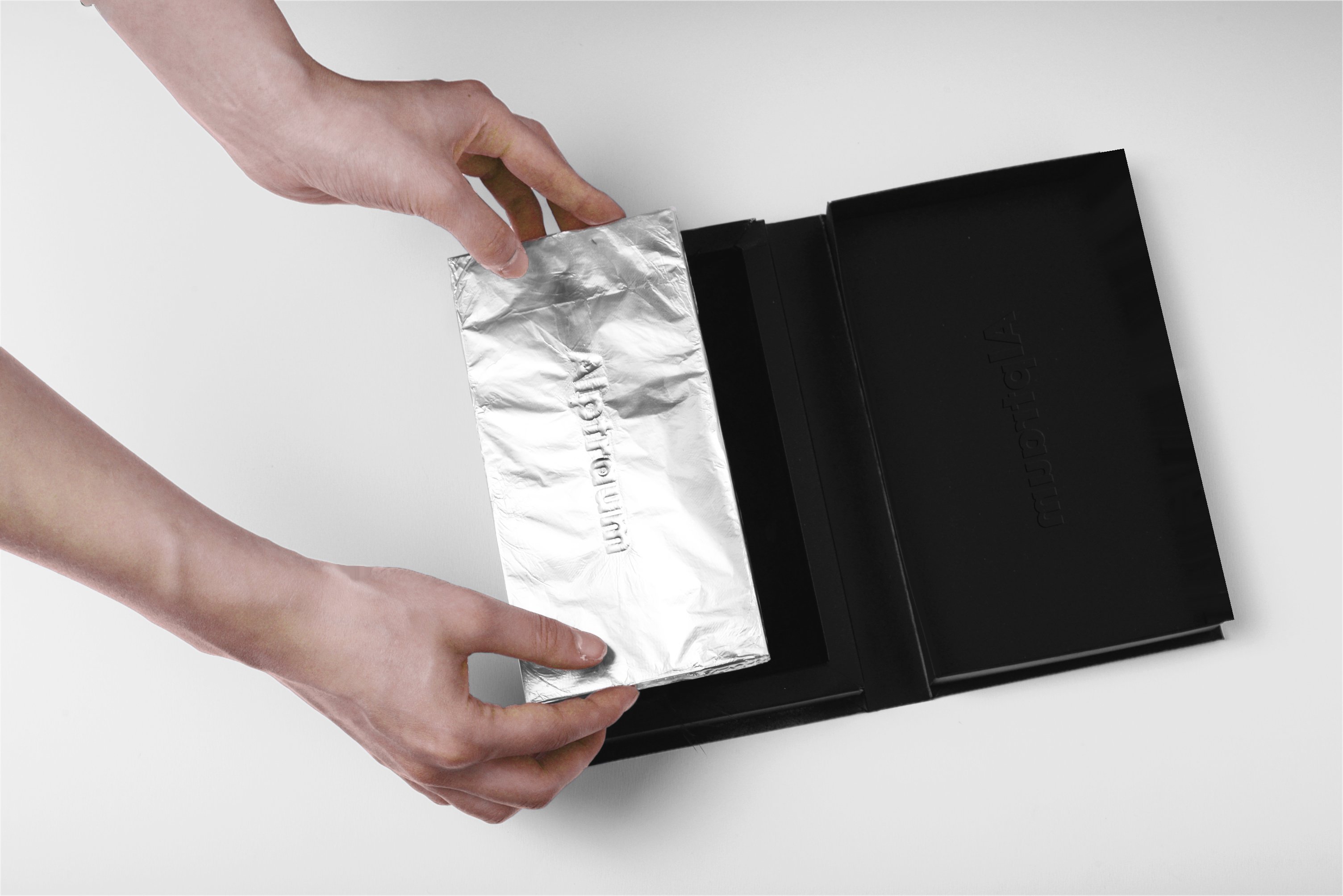
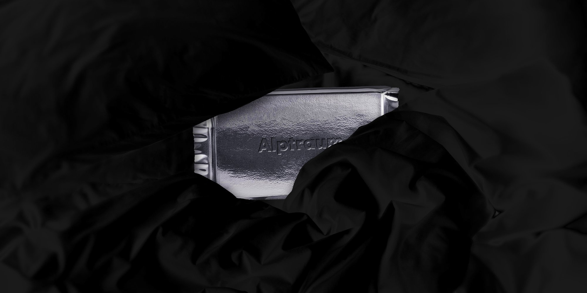
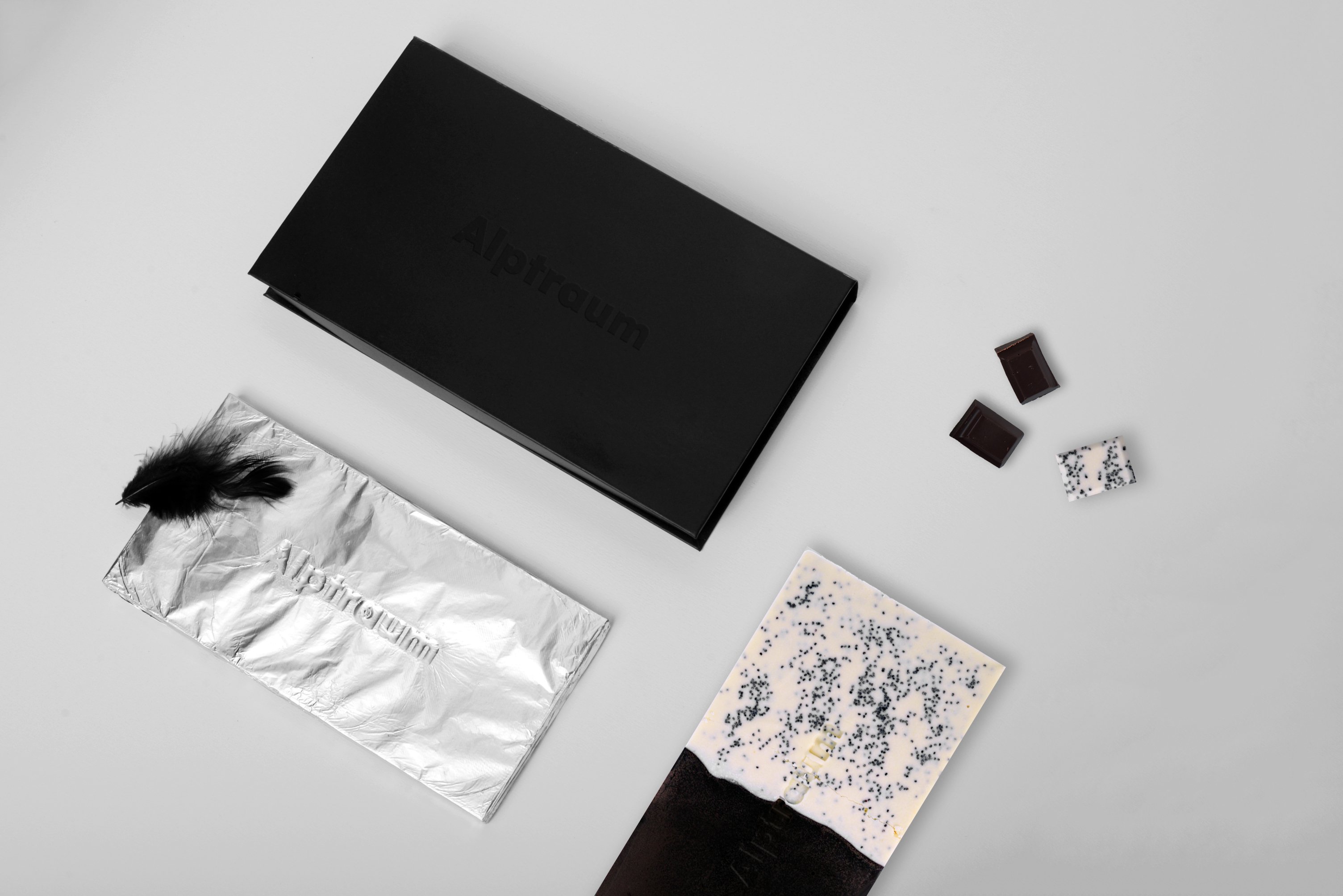
The name means “nightmare” in German, providing the first hint of the concept. Housed in a pitch black box, the chocolate has a gleaming, silver foil cover. Tearing up the wrapping, one discovers the dual nature of the product. Dark and bitter on one side, white with poppy seeds on the other. More than just a day/night or a dark/light analogy, Alptraum is a thought-provoking as well as an excellently executed design. Photographs© Nora Kaszanyi.


